Implementing Toggle Switch in Vue js using vue-js-toggle-button
What is vue-js-toggle-button?
vue-js-toggle-button is a lightweight and easy-to-use npm package designed specifically for implementing toggle buttons in Vue.js applications. With its simple API, it enables developers to create visually appealing and functional toggle switches seamlessly. These toggle buttons can be used in various scenarios, such as enabling notifications, switching themes, or toggling features in a web application.
One of the significant advantages of using vue-js-toggle-button is its flexibility. You can customize the labels, styles, and behavior of the toggle buttons to fit your application's design and user experience. This makes it an excellent choice for developers looking to enhance the interactivity of their web applications.
Prerequisites
- A basic understanding of Vue.js and its component lifecycle.
- Node.js and npm installed on your development machine.
- A Vue.js project set up and running.
Installing vue-js-toggle-button
To get started with vue-js-toggle-button, you need to install it via npm. Follow these steps:
- Open your terminal and navigate to your Vue.js project directory.
- Run the following command to install the package:
npm i vue-js-toggle-buttonOnce the installation is complete, you can proceed to import and use the package within your Vue components.
Importing and Using the Toggle Button
After installing the vue-js-toggle-button package, the next step is to import it into your Vue application. Open your main.js file and add the following lines:
import ToggleButton from 'vue-js-toggle-button';
Vue.use(ToggleButton);
With this configuration, your Vue application is now ready to use the toggle button component. You can add the toggle button to any component by including the following line in the template section:
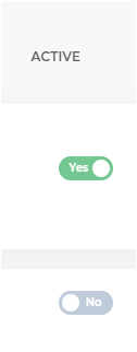
<toggle-button @change="checkData($event)" :value="Boolean(tr.isActive)" :labels="{checked: 'Yes', unchecked: 'No'}" style="margin-left: 20px" />This line creates a toggle button that listens for changes and updates the value based on the tr.isActive property. The checkData method will be triggered whenever the toggle button's state changes.
Handling Toggle Button Changes
To handle the state change of the toggle button, you need to define the checkData method in your component's script section. Here’s an example:
methods: {
    checkData(event) {
        let value = event.value; // will return true or false
        console.log('Toggle Button Value:', value);
        // Perform additional logic based on the toggle state
    }
}
In this method, you can implement any logic you need to respond to the toggle button's state. For instance, you could send a request to an API to update the user preferences or modify the local state of your component.
Styling the Toggle Button
Customizing the appearance of the toggle button is straightforward with vue-js-toggle-button. You can apply CSS styles directly to the component or use the provided props to adjust its appearance. For example, you can modify the button's colors and sizes using CSS:
.toggle-button {
    background-color: #4CAF50; /* Green */
    border-radius: 20px;
}
.toggle-button.checked {
    background-color: #FF5733; /* Red */
}
Additionally, vue-js-toggle-button allows you to pass custom classes or styles through props, enabling you to maintain a consistent design across your application.
Edge Cases & Gotchas
When implementing toggle buttons, it's essential to consider a few edge cases:
- Initial State: Ensure that the initial value of the toggle button corresponds to the actual data state. For example, if the user preference is stored in a database, retrieve it and set the toggle button's value accordingly.
- Debouncing Changes: If the toggle button triggers an API call, consider debouncing the changes to prevent excessive requests. This can be implemented using a debounce function or a library like lodash.
- Accessibility: Always ensure that your toggle button is accessible. Use appropriate ARIA attributes and ensure that it can be operated using a keyboard.
Performance & Best Practices
To ensure optimal performance when using toggle buttons in your Vue.js application, consider the following best practices:
- Keep it Simple: Avoid complex logic within the toggle button's change handler. Instead, delegate complex operations to other methods or services.
- Use Computed Properties: If your toggle button's value depends on other reactive properties, consider using computed properties to manage its state effectively.
- Test Across Browsers: Ensure that your toggle button works consistently across different browsers and devices. Test the responsiveness and behavior in various environments.
Conclusion
In this article, we explored how to implement a toggle switch in Vue.js using the vue-js-toggle-button package. We covered the installation process, usage, and handling changes effectively, along with styling and best practices.
Key takeaways include:
- Toggle buttons are essential UI elements for enhancing user interactivity.
- The vue-js-toggle-button package simplifies the implementation of toggle buttons in Vue.js applications.
- Proper handling of state changes and customization can significantly improve user experience.
- Consider edge cases and best practices to ensure robust and accessible toggle button implementations.